Skip to Content
Enter
Aardvark Accessibility
How can we redesign an educational accessibility platform?

Role

Research (Solo)

Time

09/27/22 - 12/08/22

Tools

FigJam
Overview
Aardvark Accessibility is a fictional website designed to educate designers on digital accessibility. However, it potentially presented issues with cognitive load and accessibility. I aimed to understand the prototype's struggles with presenting information and its navigation. I analyzed these issues and provided recommendations for a redesign.
Key Recommendations
  • Ensure accessibility compliance throughout the site

  • Supply help text or tutorials to explain features and content

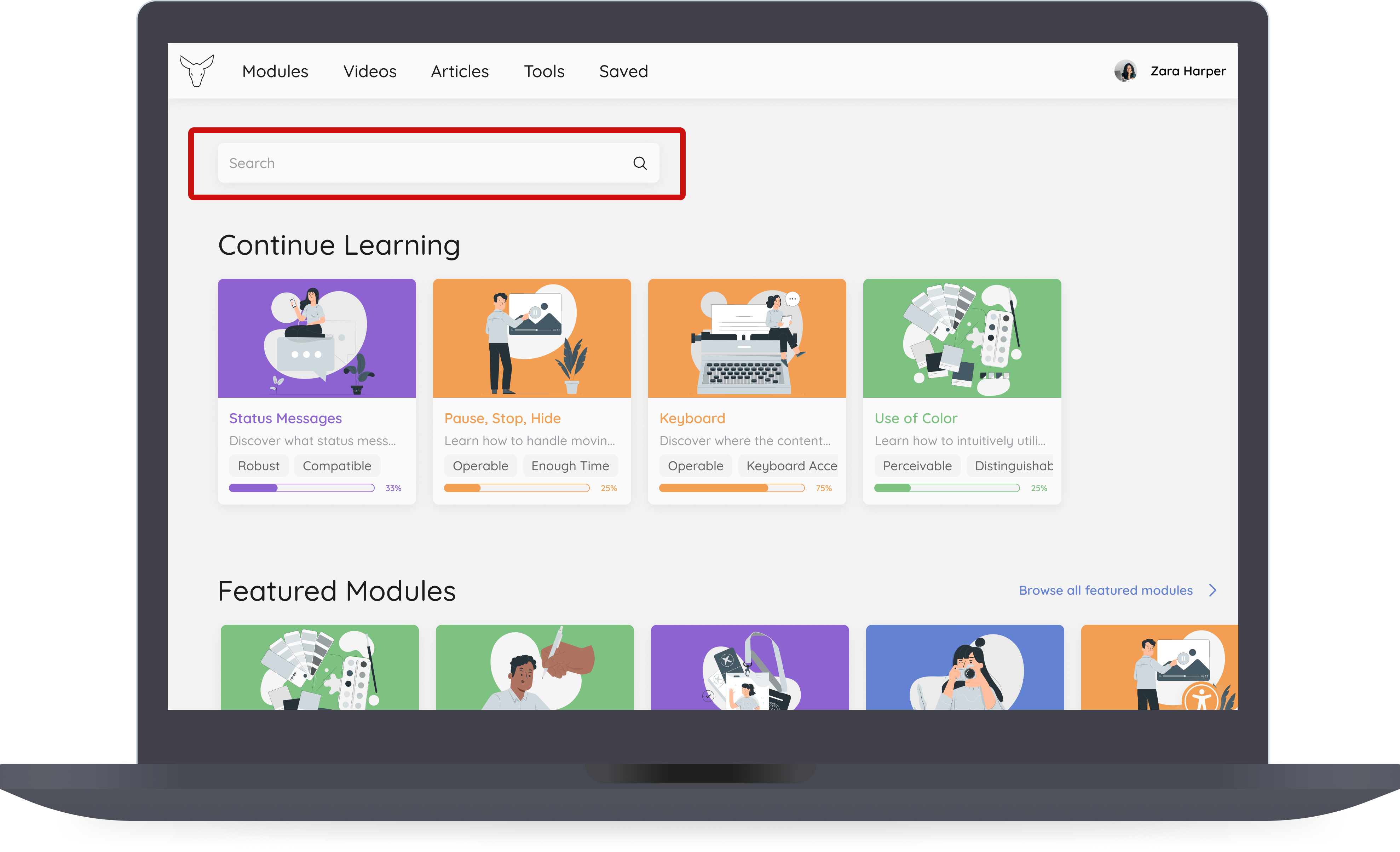
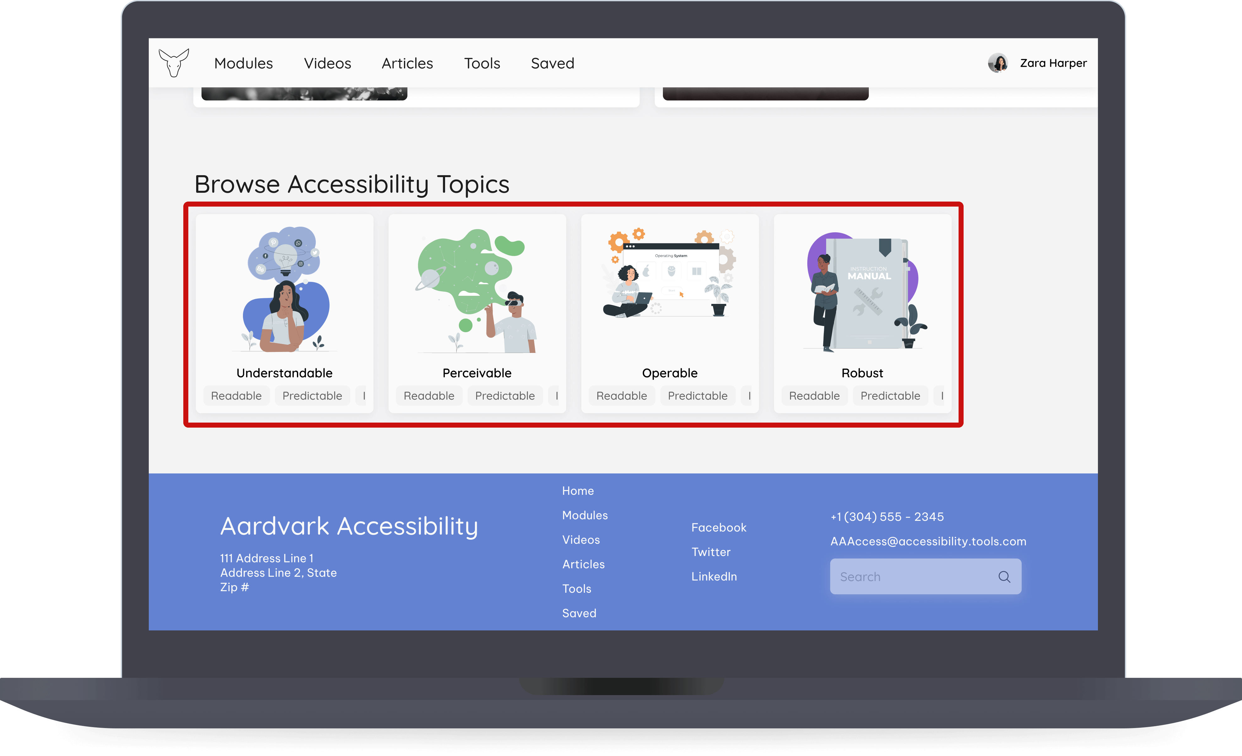
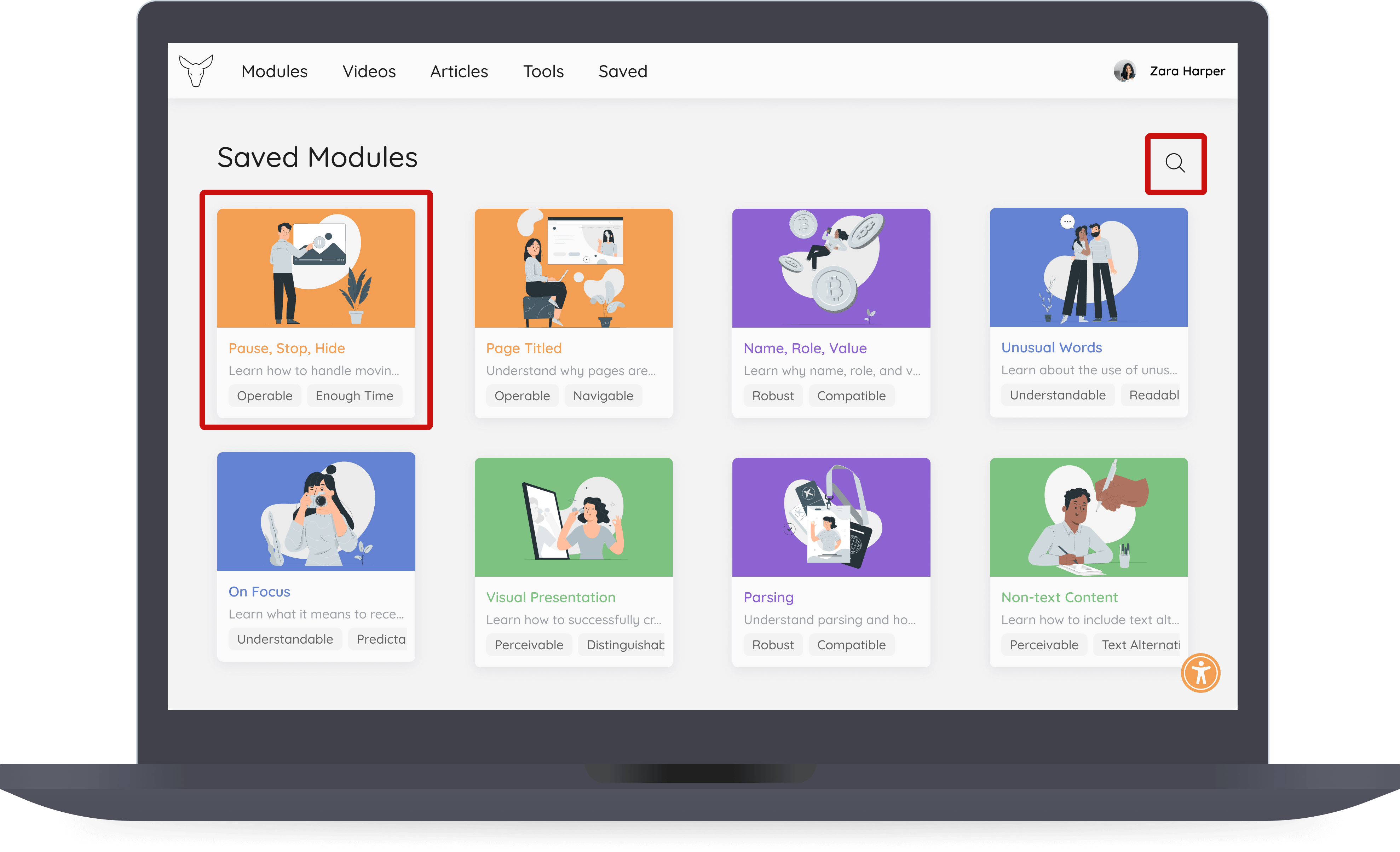
  • Provide flexibility for searching and bookmarking modules

  • Follow industry standards for learning platforms

  • Implement error messages and error recovery

Introduction
What is Aardvark Accessibility?

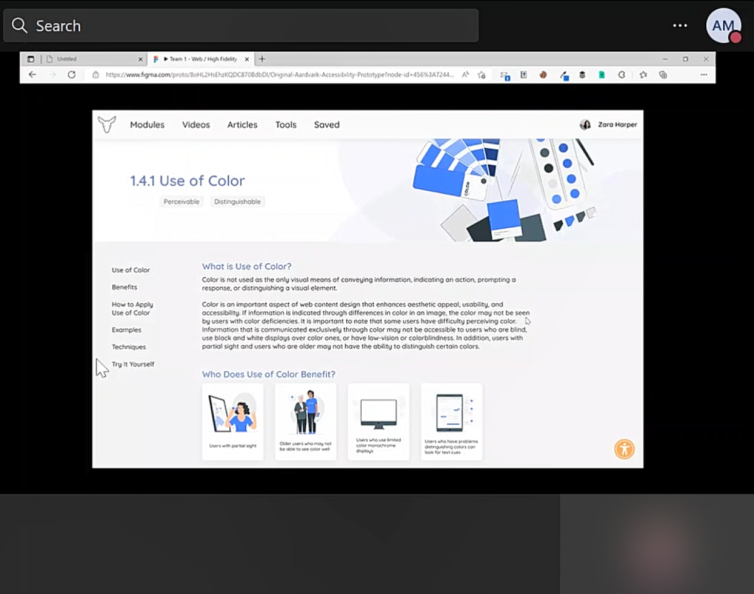
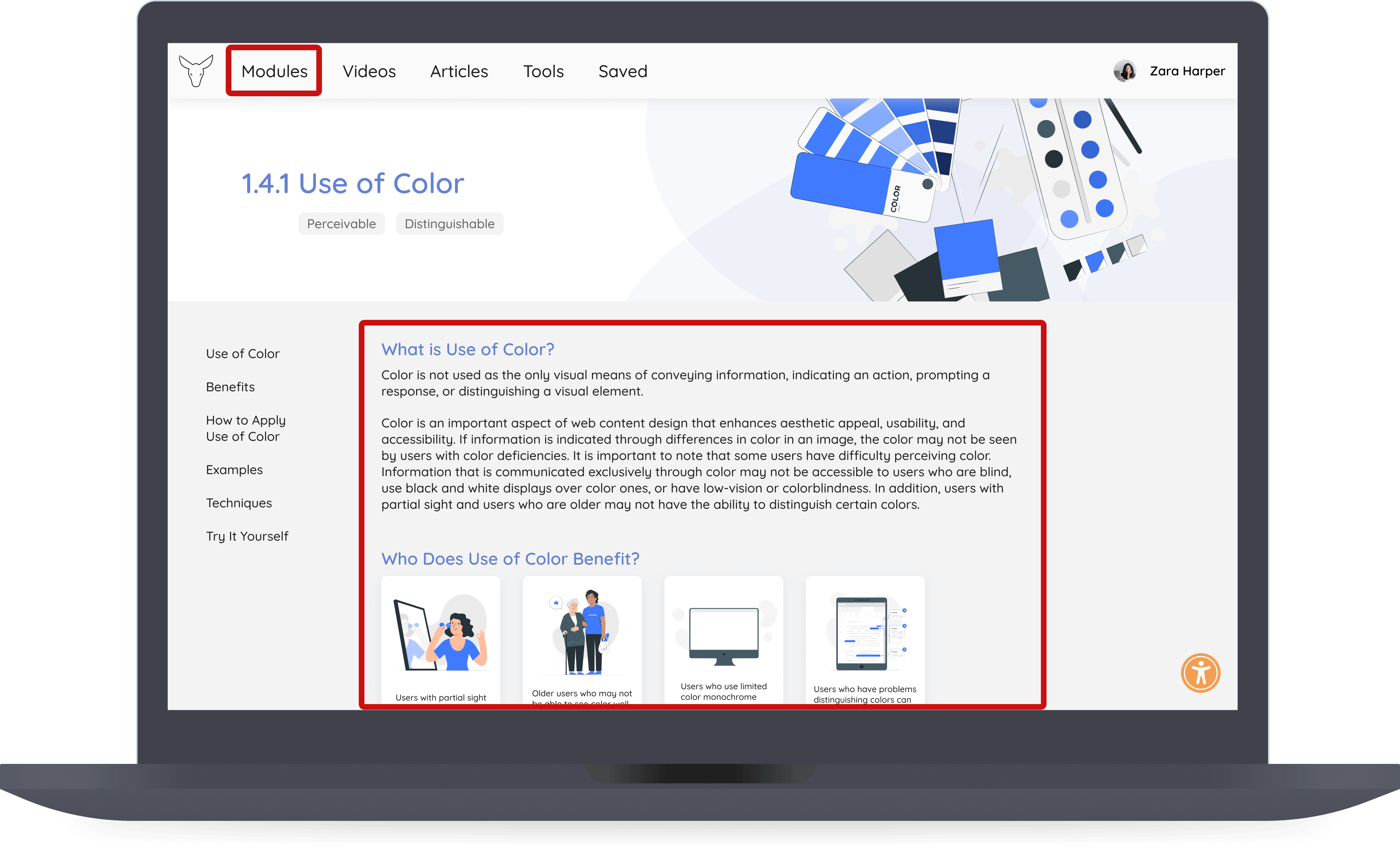
Aardvark Accessibility is a fictional website prototype created in a previous course. The primary goal of the website was to teach designers about accessibility by using learning modules based on the WCAG (Web Content Accessibility Guidelines) standards.

Problem
Cognitive Load in an Information Dense Website

After evaluating its accessibility, I found possible issues with cognitive load in the modules. Aardvark Accessibility provides a wide array of modules for junior designers to learn about Web Accessibility based on the WCAG (Web Content Accessibility Guidelines) standards. However, because of the amount of resources, a new designer may be overwhelmed, especially with the unfamiliar language.

To tackle this problem, I asked myself:

How do we teach complex topics to help beginners learn and retain information without feeling overwhelmed?

Usability Problems with the Prototype
The prototype had minor issues overall but had significant violations in three areas:
  • Help text and documentation of the content

  • Informing users of errors and recovery

  • Consistency with structure and UI elements

Understanding these issues raises questions on if these violations are affecting the cognitive load. This helps me investigate them later to not only research cognitive accessibility broadly but also specific issues that could hinder the user.
Reading on Cognitive Load
Afterward, I analyzed various resources related to accessibility. Without a thorough understanding of accessibility, it would be difficult to communicate in interviews and understand their obstacles to learning. I researched:
  • Digital accessibility and the WCAG standards

  • The effects of cognitive load on processing information

  • Discussions between designers and accessibility experts

New Insights into Accessibility
I began connecting the issues with cognitive load to poor accessibility and solutions like accessibility overlays. This addresses the website’s use of an overlay to force users to adjust the text and motion in the interface, potentially interrupting their learning process. By recognizing these solutions as potential issues, I made a note to investigate this potential friction in the user interviews further in the process.
Comparing Competitors
To cover how websites approach accessibility in their platforms, I extended the competitive audit from the previous course to focus on accessibility tools and evaluators. The goal is to understand what’s expected in the market and where the product could differentiate to convince users to switch to using the website.
How the Website Can Differentiate
While many of the tools accounted for different disabilities, they lacked explanations of violations or acted as a “shortcut” to resolving the inaccessibility of a design. They may provide quick solutions as to what to fix but don’t teach designers how to learn and prevent these issues in the future. Teaching designers about accessibility and how to implement it can help the platform differentiate itself.
Preparing for Interviews
What Does This Research Tell Us?
Before interviewing potential users, it’s crucial to assess our findings and how they can inform the questions and direction for the interview. So far, my research has raised questions:
After reviewing the prior audit, I found that many learning platforms structure modules as sectioned processes. Can our article layout cause users to use more mental load to understand the layout?
Listening to accessibility experts emphasized the pitfalls of accessibility overlays. How much cognitive load and time are they using towards changing settings versus learning?
When teaching a complex topic, the platform should provide as much context as possible. Without knowing the basics or WCAG pillars, how can a designer truly understand the content?
Interviewing Our Users
I interviewed four junior designers to gain insight into their background, understanding of accessibility, and their approach to complex topics. Without speaking to users, I could make assumptions that don’t accurately depict their frustrations, resulting in the website potentially hindering their learning process.
A Glimpse Into Our Users
Before diving deep into their responses, the designers that I interviewed:
  • Came from different backgrounds (ex. university, bootcamp)

  • Were inexperienced with designing for accessibility

  • Relied on breaking down complex information to learn

  • Physically organize or visually distinguish information

Their unfamiliarity makes it crucial that the modules explain the basics, avoid complex topics early on, and format modules in ways they’d find engaging.
Gaining More Insignt on Usability
What Gaps Can I Fill In My Research?
While the original process included the prior stages, I felt that I needed more insight into how users handle the site. While I can use my findings from the interviews, seeing a user's frustrations can gauge whether my assumptions about the structure and context did affect their use of the website. To do so, I implemented some usability tests.
Testing the Prototype
While the interviews revealed the users’ needs with learning accessibility, it’s vital to observe how a potential user would navigate the prototype through usability testing. The goal is to understand what areas in the prototype are inhibiting the users’ actions and goals to prevent these issues in the future.
Observations During the Tests
In the tests, the designers found that the color coding structure and onboarding questionnaire’s purpose aren’t explained well. The modules are also structured like articles versus modules they’re familiar with like Duolingo. Observing their frustrations with these areas of the website highlights issues that distracted them when finding modules and understanding the content.
Connecting the Dots
After the interviews and tests, I synthesized their responses with behavioral mapping, which involves organizing them into attributes, or patterns. The goal is to determine the goals and frustrations observed to update the persona, a representation of the user. This helps stakeholders digest our findings easier and empathize with the user.
What Did I Learn About Zara?
By updating the persona from the previous course, I can discern the obstacles that the original prototype created. The most significant causes of her confusion are the structure of the modules, lack of explanation for how the website is organized, and inconsistency with functions and errors.
Reporting My Findings
Research Report
After determining the problem areas with the prototype. I compiled a research report to communicate my findings.
Recommendations
After researching cognitive load and the designers’ goals and needs, I was able to determine areas they were struggling with and how to approach these issues. These are my recommendations for improving the cognitive load in the learning experience.
Takeaways
This capstone course was a valuable experience as a designer. I not only learned more about accessibility, but I was also able to revisit a past project to improve upon it. While these findings and recommendations aimed to improve the Aardvark Accessibility prototype, I will retain them to create more accessible designs in the future.